Build a Personal Timeline with GraphCMS and SvelteKit
Build and deploy your own personal timeline inspired by Polywork, with GraphCMS and SvelteKit
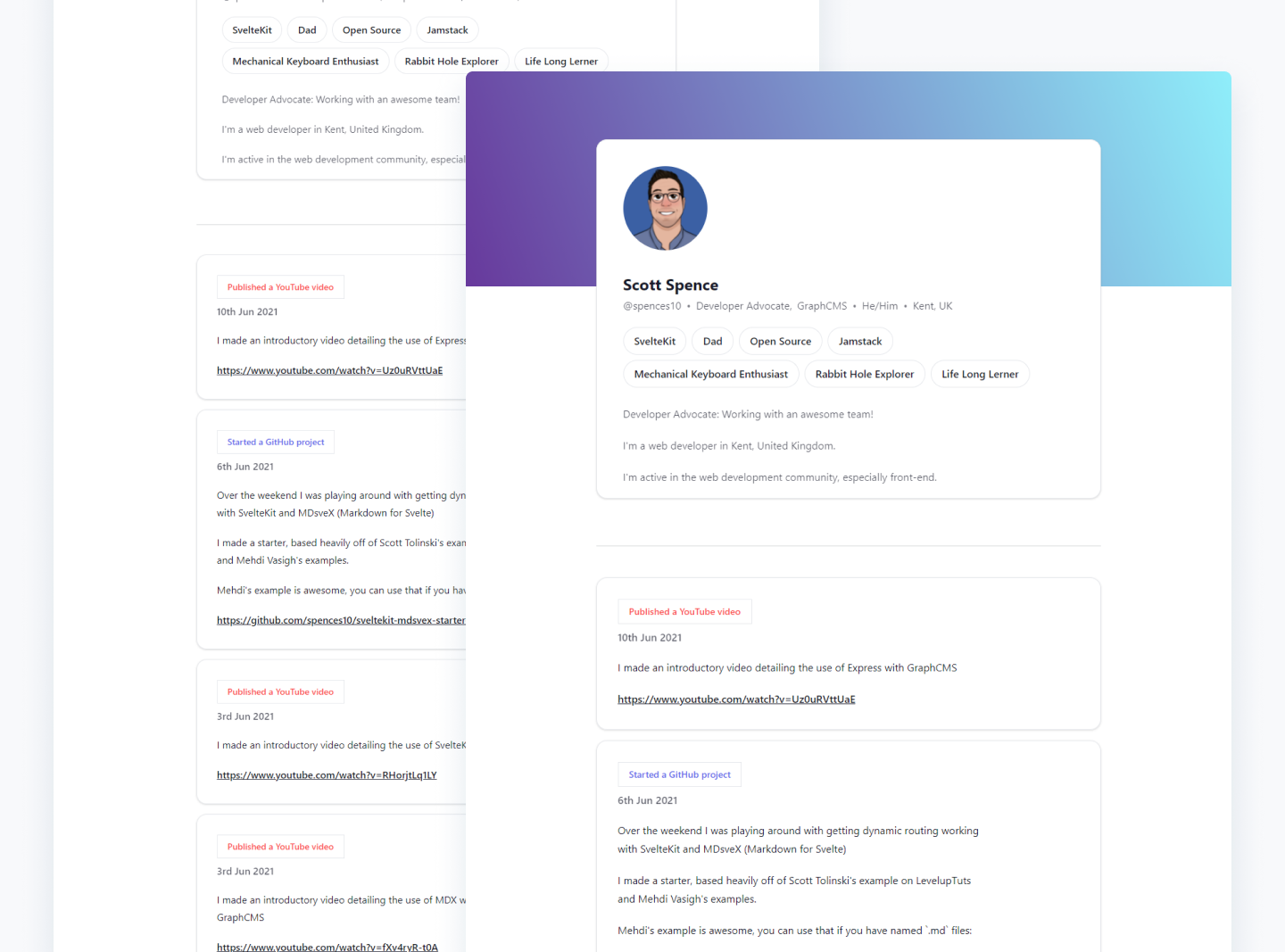
In this guide, I'll be making a personal timeline using GraphCMS and SvelteKit, heavily inspired by Polywork’s approach to building personal profiles. If you’re wondering what Polywork is, it's a new platform where you can create a whole timeline of all your milestones and achievements and not just the roles or positions you have worked in before.
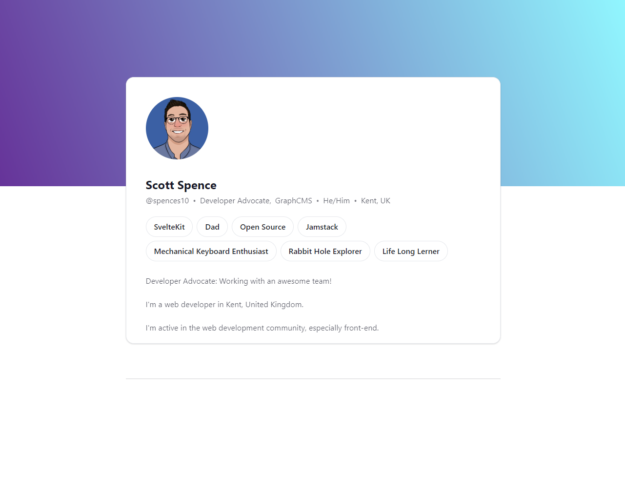
Here's what the end result will look like:
This option will give you that timeline you can add to your own site or have it as a stand-alone webpage.
This guide will cover getting your backend set up in GraphCMS and creating your own content model of your timeline. I'll then go into displaying that content model on a web page.
If you've not used GraphCMS before, you can take a look at the video playlists for how to Get Started with GraphCMS and for further details, there's also the How to GraphCMS playlist to check out.
Create the content modelAnchor
Taking a look at a user's Polywork profile (timeline) I'll break that down into the relevant content types.
So a high-level overview of the content types I'm going to need will be:
- User: name, current position, location, bio, and pronoun.
- User Badges: what your interests are, JavaScript, Rock Climbing, etc.
- Activity Detail: this is the detail of what you did, like 'started a side project'.
- Tags: These are the tags you've applied to your activity, like 'Published a YouTube video'.
I'll now break down the content model as I'm going to create it in GraphCMS. All of the GraphCMS features I'll be using can be done with the community plan in this example.
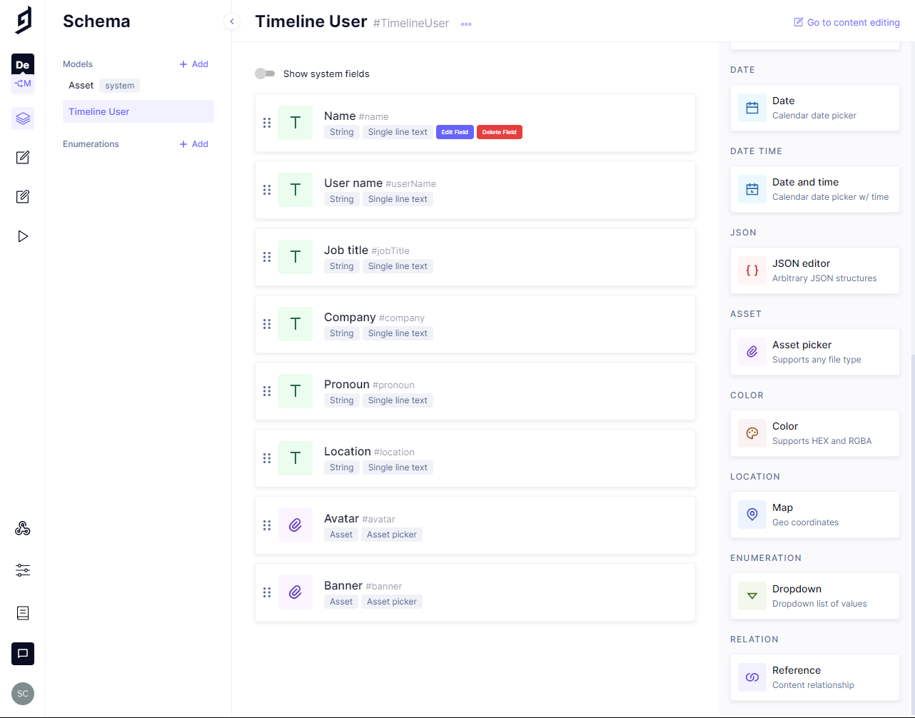
Model Name: Timeline User
- Field types
- Name > Single line text
- Username > Single line text > Validations > Set fields as unique
- Job title > Single line text
- Company > Single line text
- Pronoun > Single line text
- Location > Single line text
- Avatar > Asset picker
- Banner > Asset picker
- Bio > Multi line text
- Field types
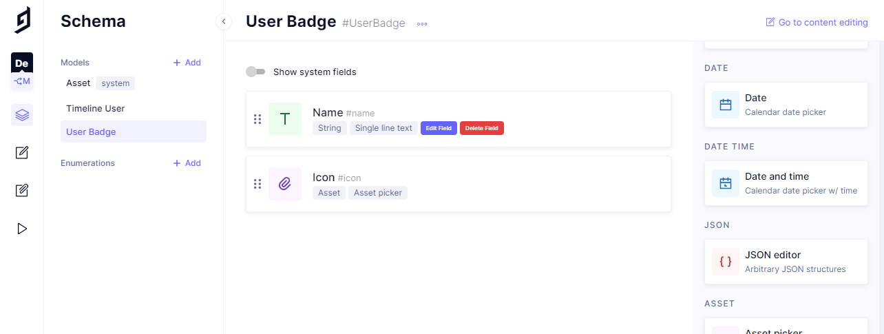
Model Name: User Badge
- Field types
- Name > Single line text
- Icon > Asset
- Field types
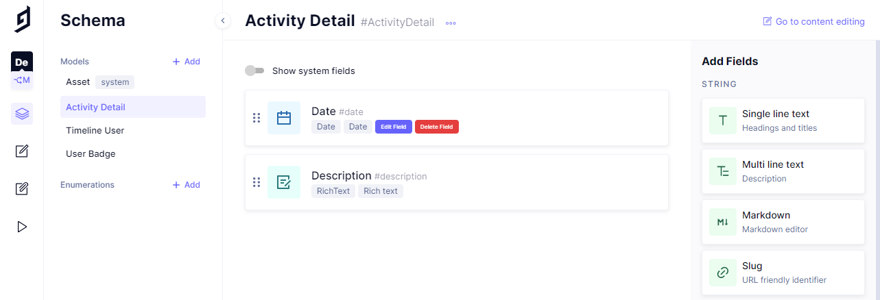
Model Name: Activity Detail
- Field types
- Date > Date
- Description > Rich text
- Field types
Model Name: Activity Tag
- Field types
- Name > Single line text
- Badge Colour > Color
- Field types
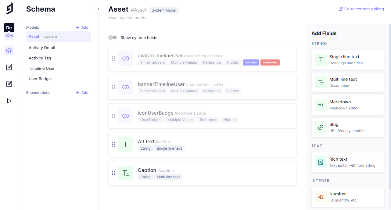
Finally, for the content model, I will add some additional fields for the assets to include an alt text and a caption, Alt text as a 'Single line text' and the Caption as a 'Multi line text'.
Now that I have the models created, I can add in the relations for them with a Reference field:
Timeline User
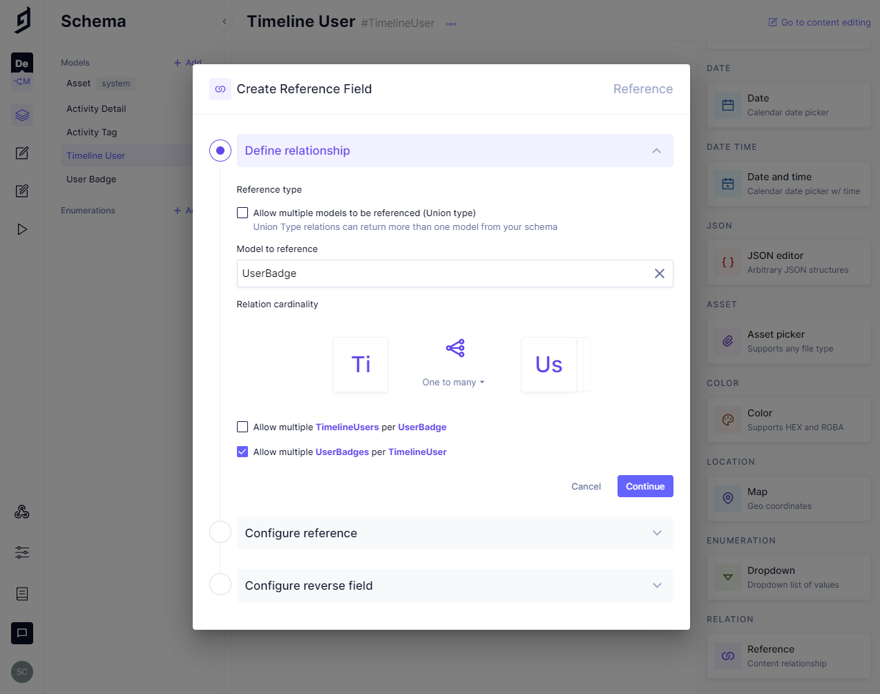
- User Badge > Model to reference > User badge > Allow multiple UserBadges per TimelineUser
- Activity Details > Model to reference > Activity Detail > Allow multiple ActivityDetails per TimelineUser
If there were more than one user in the content model, I'd also check to Allow multiple Users per UserBadge and the same for the ActivityDetail. As it's only for me I'll keep it one to many for both.
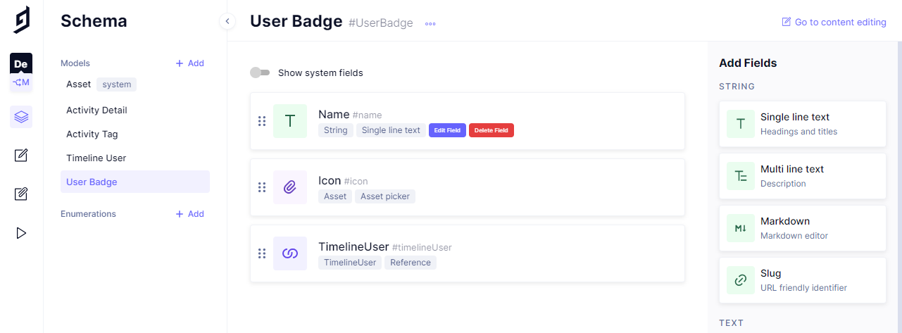
Now there's a reverse field for Timeline User in the User Badge model and also for the Activity Detail.
User Badge
- TimelineUser > Reference
Activity Detail
- Timeline User > Reference
- Activity Tag > Model to reference > Activity Tag > Allow multiple ActivityDetails per ActivityTag + Allow multiple ActivityTags per ActivityDetail
- Activity Tag
- Activity Details > Reference
If you're following along feel free to add your own validations to the fields, as it's only going to be small amounts of information I'm adding I'm going to leave them with the default validation.
Now that I have the content model created, I'll need to enable public access for the front end to use it.
In Settings > API access > Public Content API I'll enable the defaults by clicking the 'Yes, initialize defaults' button.
I'll copy some of the content from my Polywork profile and add it to my content model now.
The front-endAnchor
For the front end, I'll be using SvelteKit, ultimately this can be any framework you are comfortable with. For the ease of scaffolding out the project, I'll be using SvelteKit along with DaisyUI which utilizes Tailwind and Tailwind prose.
As this is a single-page project and the main part of the project is on a single file, this can be done in any technology of your choosing.
I'll initialize the project with the following:
npm init svelte@next timeline
In my case I'm going to be choosing the following CLI options:
- Skeleton project
- No to TypeScript
- No to ESLint
- Yes to Prettier
Now if I pop open my text editor (VSCode), this is the basic project structure I have:
src/│ └─ routes/│ │ └─ index.svelte│ └─ app.html├─ static/├─ .gitignore├─ .npmrc├─ .prettierignore├─ .prettierrc├─ jsconfig.json├─ package.json├─ README.md└─ svelte.config.js
Time to install the dependencies, Tailwind and DaisyUI, along with Tailwind typography for great typography defaults it offers. Those along with GraphQL request, GraphQL.js (graphql) and Date FNS:
# add additional dependenciesnpx svelte-add tailwindcss --jit# 👆 this will configure Tailwind with Just In Timenpm i -D daisyui @tailwindcss/typography graphql-request graphql date-fnsnpm i # shorthand for npm install
The Tailwind JIT compiler is optional, if you don't want to use it then you can remove the --jit from the npx command.
If you're following along, you'll notice svelte-add for Tailwind added some extra files to the project and changed others:
src/│ └─ routes/│ │ └─ __layout.svelte│ └─ app.postcss├─ postcss.config.js├─ svelte.config.js├─ tailwind.config.cjs...rest mainly unchanged
Note the __layout.svelte was added and some additional config files for post CSS and Tailwind.
Popping open the __layout.svelte file I can see that the global CSS file has been added for the whole project:
<script context="module">import '../app.postcss'</script><main><slot /></main>
I'm going to leave this unchanged and focus on the routes/index.svelte file for the majority of the work.
I'll need to add the typography plugin and DaisyUI to the tailwind.config.js file:
const config = {mode: 'jit',purge: ['./src/**/*.{html,js,svelte,ts}'],theme: {extend: {},},plugins: [require('@tailwindcss/typography'), require('daisyui')],}module.exports = config
There's also the default theme I'll need to set for DaisyUI in the srcapp.html file:
<!DOCTYPE html><html lang="en" data-theme="corporate"><head><!-- rest of the file unchanged --></head></html>
Note that DaisyUI is after the typography plugin on the plugins array.
Let's get to work!Anchor
As I mentioned earlier this will be a single file project, if you're following along and want to break it into more manageable parts, I'll leave that to you.
Import the data for use on the pageAnchor
Now, I need to get the data from the GraphCMS endpoint, as it's a public endpoint I can put it straight into the code, but I'll add this to an environment file so that it can be used from one place. I'll create a .env file and add in the endpoint there:
touch .env
In the newly created .env file, I'll create an environment variable and assign the project endpoint to it:
VITE_CONTENT_API=https://api-eu-central-1.graphcms.com/v2/projectid/master
Not the VITE_ prefix is needed for Svelte to access the variable, Vite is the SvelteKit build tool and the VITE_ prefix is needed so the variable can be accessed on the client (browser).
Because I don't want to commit the .env file to GitHub I'll add .env to the .gitignore file, here's what my git ignore looks like:
.DS_Storenode_modules/.svelte-kit/package.env
Now that I have the endpoint available to me via Vite, I can go about getting the data to use in the project.
I'll add a <script context="module"> to the top of my index.svelte file, this will fetch the data before the page loads.
In that block, I'm going to define a new GraphQLClient as graphcms then I'll bring in the API endpoint to use in the client.
I'll need to define a query to retrieve all the timeline information to use. I'll come onto that next for now. I'll define an empty gql tag to be passed to the client. The results from that query are then returned as props for the client to use.
<script context="module">import { gql, GraphQLClient } from 'graphql-request'export async function load() {const graphcms = new GraphQLClient(import.meta.env.VITE_CONTENT_API,{headers: {},})const query = gql``const { timelineUser } = await graphcms.request(query)return {props: {timelineUser,},}}</script>
Now, I need to define the query needed to pull all the user and timeline information.
In the GraphCMS API playground I'll define all the fields I need:
{timelineUser(where: { username: "spences10" }) {idnameusernamejobTitlecompanypronounlocationbioavatar {urlaltText}banner {urlaltText}userBadges {name}activityDetails(orderBy: createdAt_DESC) {datedescription {html}activityTags {idnamebadgeColour {hex}}}}}
That query can go into the empty gql tag I had in the previous code example. Note that I have hardcoded the timeline user with my username timelineUser(where: { username: "spences10" }), if you have more than one user then this would be a good time to look into SvelteKit routing. I won't be covering that in this post but you can check out the documentation if you want to take it to the next level with this project.
Sweet! So now that I have the data available to me to use in the client, I can now focus on displaying that data.
Use the data on the pageAnchor
I'll add a <script> directly under the closing <script context="module"> tag. This is where I can access the props returned by the <script context="module"> block.
I'll define export let timelineUser prop then destructure all the variables I'll need from it, and notice all the variables match up to the GraphQL query.
<script>export let timelineUserlet { name, username, jobTitle, company, pronoun, location, bio, banner, avatar, userBadges, activityDetails } = timelineUser</script>
Now I'll go about first adding in the banner, this will be at the top of the page taking up the full width of the page:
<img alt="{banner.altText}" src="{banner.url}" class="h-96 w-full" />
Now I'll add in some containers for the basics card (username, job title etc...) and the activity list, then create a component for those to be used in the index.svelte file:
<!-- Containers --><article class="mx-auto -mt-72 max-w-7xl px-4 relative sm:px-6 lg:px-8"><div class="mx-auto max-w-3xl"><!-- Basics Card --><div class="divider opacity-10 mb-10" /><!-- Activities List --></div></article>
Basics cardAnchor
I'll create a new folder and files for the basics card and the activities components now in the terminal:
mkdir src/libtouch src/lib/basics.sveltetouch src/lib/activities.svelte
In the basics.svelte file I'm going to need to import some props, I'll start with the avatar and the name. For this, I'll add the props inside some <script> tags and scaffold out the markup for the avatar and the name:
<script>export let avatarexport let name</script><div class="bg-white border my-16 card shadow"><figure class="px-10 pt-10"><div class="avatar"><div class="rounded-full h-32 mb-8 w-32"><img alt="{avatar.altText}" src="{avatar.url}" /></div></div><h2 class="font-bold text-left leading-relaxed text-2xl">{name}</h2></figure></div>
Then, I can add in the following for username, jobTitle, company, pronoun and location to an unordered list:
<script>export let avatarexport let nameexport let usernameexport let jobTitleexport let companyexport let pronounexport let location</script><div class="bg-white border my-16 card shadow"><figure class="px-10 pt-10"><div class="avatar"><div class="rounded-full h-32 mb-8 w-32"><img alt="{avatar.altText}" src="{avatar.url}" /></div></div><h2 class="font-bold text-left leading-relaxed text-2xl">{name}</h2><ul class="flex space-x-2 text-left leading-relaxed opacity-75"><li>@{username}</li><span class="opacity-75">•</span><li>{jobTitle},</li><li>{company}</li><span class="opacity-75">•</span><li>{pronoun}</li><span class="opacity-75">•</span><li>{location}</li></ul></figure></div>
Next up for the basics card is adding in any user badges, I'll use the Svelte 'if' directive {#if userBadges} to check if there are any badges to render then looping over each badge in the userBadges props if there is with the Svelte 'each' directive {#each userBadges as { name }}:
<script>export let avatarexport let nameexport let usernameexport let jobTitleexport let companyexport let pronounexport let locationexport let userBadges</script><div class="bg-white border my-16 card shadow"><figure class="px-10 pt-10"><div class="avatar"><div class="rounded-full h-32 mb-8 w-32"><img alt="{avatar.altText}" src="{avatar.url}" /></div></div><h2 class="font-bold text-left leading-relaxed text-2xl">{name}</h2><ul class="flex space-x-2 text-left leading-relaxed opacity-75"><li>@{username}</li><span class="opacity-75">•</span><li>{jobTitle},</li><li>{company}</li><span class="opacity-75">•</span><li>{pronoun}</li><span class="opacity-75">•</span><li>{location}</li></ul><div>{#if userBadges}<div class="flex flex-wrap mt-5 break-words relative">{#each userBadges as { name }}<div class="border rounded-full font-medium mr-2 mb-2 py-2 px-4">{name}</div>{/each}</div>{/if}</div></figure></div>
Last up is adding in the Multi line text for the bio, note I've added in some JavaScript to take care of any line breaks with {@html bio.split('\n').join('<br />')}, the @html is to render HTML directly if this is left out it will show the HTML tags in the markup:
<script>export let avatarexport let nameexport let usernameexport let jobTitleexport let companyexport let pronounexport let locationexport let userBadgesexport let bio</script><div class="bg-white border my-16 card shadow"><figure class="px-10 pt-10"><div class="avatar"><div class="rounded-full h-32 mb-8 w-32"><img alt="{avatar.altText}" src="{avatar.url}" /></div></div><h2 class="font-bold text-left leading-relaxed text-2xl">{name}</h2><ul class="flex space-x-2 text-left leading-relaxed opacity-75"><li>@{username}</li><span class="opacity-75">•</span><li>{jobTitle},</li><li>{company}</li><span class="opacity-75">•</span><li>{pronoun}</li><span class="opacity-75">•</span><li>{location}</li></ul><div>{#if userBadges}<div class="flex flex-wrap mt-5 break-words relative">{#each userBadges as { name }}<div class="border rounded-full font-medium mr-2 mb-2 py-2 px-4">{name}</div>{/each}</div>{/if}</div><div class="my-5 opacity-75"><p>{@html bio.split('\n').join('<br />')}</p></div></figure></div>
Now, I can go over to the index.svelte file and import the basics card at the top of the file:
<script context="module">import Basics from '$lib/basics.svelte'
Then to use the basics card and pass it all the props it needs:
<!-- Containers --><articleclass="mx-auto -mt-72 max-w-7xl px-4 relative sm:px-6 lg:px-8"><div class="mx-auto max-w-3xl"><!-- Basics Card --><Basics{avatar}{name}{bio}{username}{jobTitle}{company}{pronoun}{location}{userBadges}/><div class="divider opacity-10 mb-10" /><!-- Activities List --></div></article>
In Svelte, if the name of the prop being passed is the same as what's being expected by the component then there's no need to define the name of the prop, so avatar={avatar} becomes {avatar} neat eh?
Here's what I have so far:
Activity Details cardAnchor
Now to go through the same process for the activities card, I've already got the file so in src/lib/activities.svelte I'll start scaffolding out what's needed there, this one is a bit simpler as it's only taking the activityDetails prop:
<script>import { format } from 'date-fns'export let activityDetails</script><section>{#if activityDetails}{#each activityDetails as activity}<section class="border mb-4 card shadow"><div class="card-body">{#if activity.activityTags}{#each activity.activityTags as { name, badgeColour }}<div class="flex flex-wrap break-words relative"><divclass="border font-semibold mr-2 text-sm mb-2 w-auto py-2 px-4"><p style="color:{badgeColour.hex}">{name}</p></div></div>{/each}{/if}<p class="font-semibold mb-5 opacity-75">{format(new Date(activity.date), 'do MMM yyy')}</p><div class="prose">{@html activity.description.html}</div></div></section>{/each}{/if}</section>
Again, there's a lot of use of the Svelte directives for 'if' and 'each' here along with the @html tag. I'll break it down a bit into what's going on here. The first 'if' is to conditionally render any activities if there are any and the next is to check if there are any activity tags applied to the activity.
If there are tags, they are being looped over to add to the activity. I'm using date-fns to format the date as I like then finally rendering out the activity detail!
Now, I can import this component into my index.svelte file at the top of the file like with the basics card:
<script context="module">import Activities from '$lib/activities.svelte'import Basics from '$lib/basics.svelte'
And that's it! 😅
If you want to check out the code, I've made it available on GitHub.
DeployAnchor
I'll be deploying this project to Vercel. There are other providers available like Render and Netlify if you prefer, but for the ease of setting up, I'll be using Vercel.
I'll need to install a SvelteKit adapter for Vercel, I'll install it with the following command:
npm i -D @sveltejs/adapter-vercel@next
Note the @next as part of the install.
Next up, I'll need to add the adapter to my svelte.config.js file, here's what mine looks like:
import adapter from '@sveltejs/adapter-vercel'import preprocess from 'svelte-preprocess'/** @type {import('@sveltejs/kit').Config} */const config = {kit: {// hydrate the <div id="svelte"> element in src/app.htmltarget: '#svelte',adapter: adapter(),},preprocess: [preprocess({postcss: true,}),],}export default config// Workaround until SvelteKit uses Vite 2.3.8 (and it's confirmed to fix the Tailwind JIT problem)const mode = process.env.NODE_ENVconst dev = mode === 'development'process.env.TAILWIND_MODE = dev ? 'watch' : 'build'
From here, I can use the Vercel CLI and use vc from the command line to deploy it. I have also the added option to link the Vercel project to a GitHub repo.
If you're using SvelteKit and want to use a different hosting provider there are several adapters available via the SvelteKit documentation.
That's it, thanks for reading, if you want to take a look at the code for this you can find it over on my GitHub and the working example can be found here.
