How we Organize our Files and Projects in Figma
To kick off this multi-part series, let's look into the high-level overview of our team and project setup.


As the Lead Product Designer at GraphCMS, I’d like to share our design process at GraphCMS.
This will be a multi-part series, so let me start by giving you a high-level overview of our team and project setup. We're a fairly small team, so we only need one team account in Figma. Under our team, we've got separate projects for:
- ⚡️ Feature
- 🎨 Baukasten (our Design System)
- 🔥 Marketing
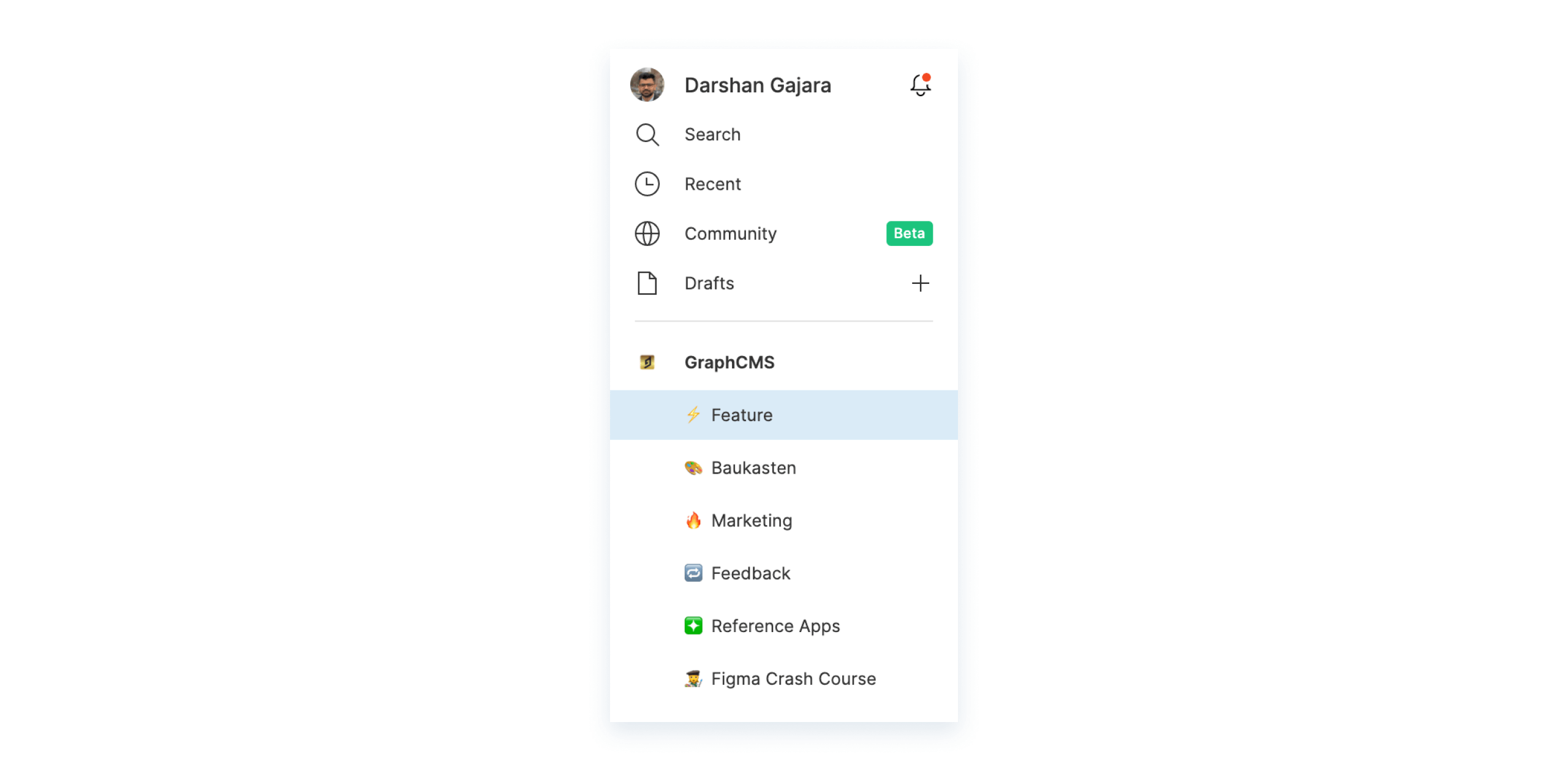
We also maintain other non-regular projects like Feedback, Figma Crash Course, Reference Applications, etc.
What goes into each projectAnchor
⚡️ FeatureAnchor

This project is dedicated to new features and improvement work on the product. At present, our web app is our only product, so it's relatively easier to keep everything feature-related under one project.
🎨 BaukastenAnchor
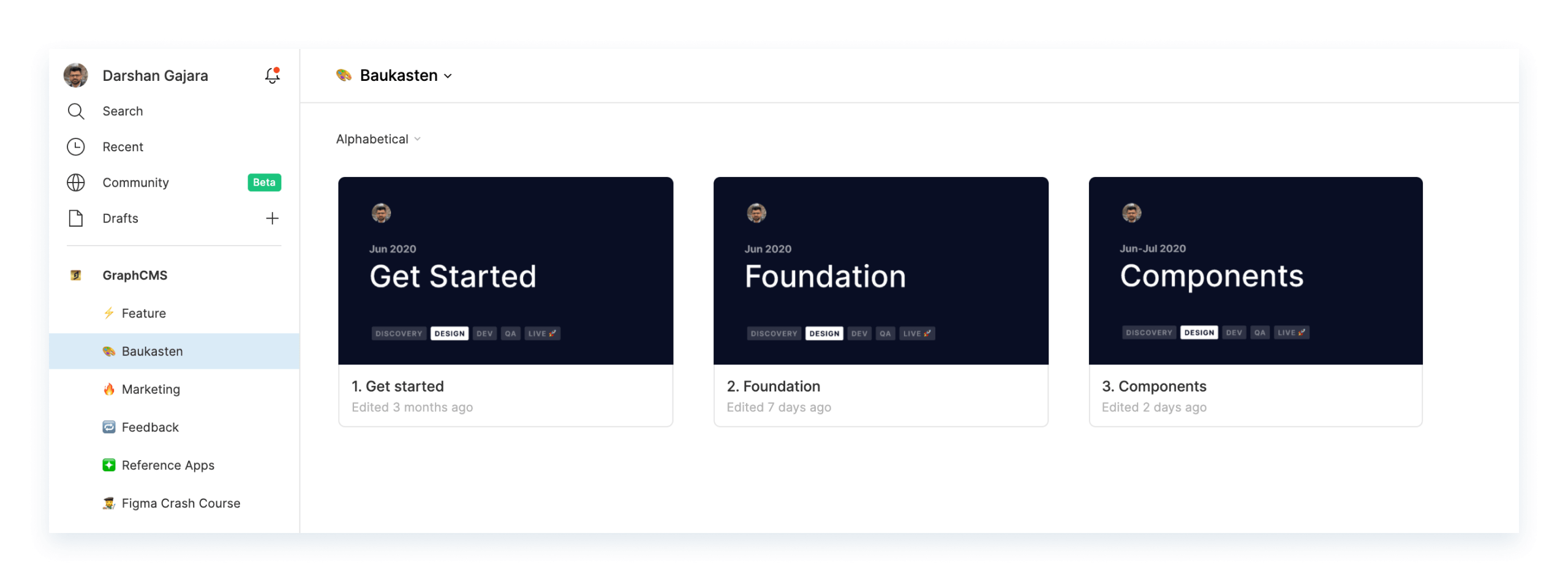
Baukasten is a German word for construction kit. Think of it as legos – the building blocks of our product. This project holds our style guides and components.
Note: We’ll do a separate post on our design system later. Keep an eye on this space.
🔥 MarketingAnchor
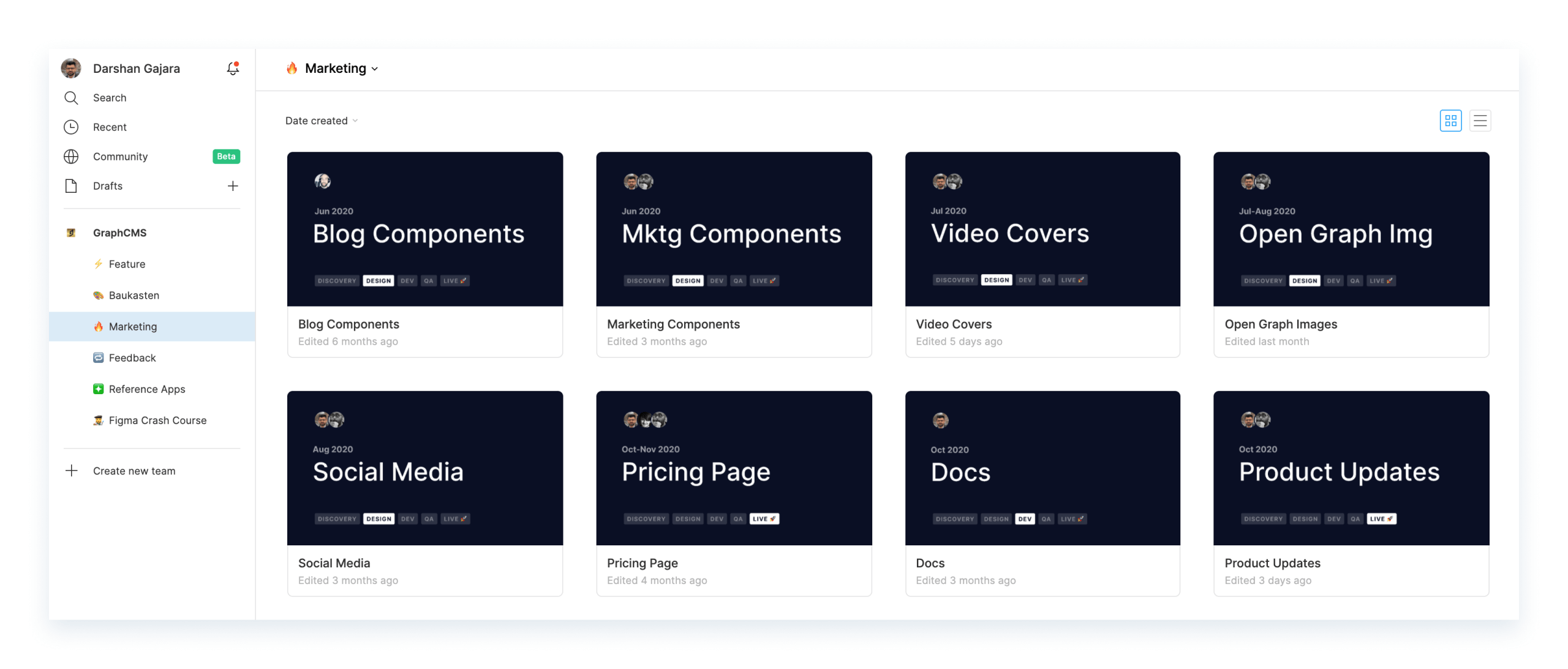
The project is dedicated to our marketing website and community work, which includes docs, blog posts, videos, GitHub repos, conferences, social media, etc. The community is central to our product and we try to support our developer advocates with graphics and assets as much as we can.
Apart from these 3 main projects, we create new projects for non-regular work. For example, I did a Figma training session for our team when we moved to Figma as our design tool. So we created a new project to use as a playground.
To understand how this process works, let’s take a deeper dive into the Feature project setup.
⚡️ FeatureAnchor

Let's peek inside a feature file. Every feature file has these separate pages:
- Cover
- 🔍 Research
- 📝 Scratchpad
- ✅ UI
- ▶️ Prototype
- 👌 QA
Here’s what goes inside every page:
CoverAnchor

We dedicate the first page of the file to the cover. A cover can also be set by using a frame as a custom thumbnail but it doesn't scale well for different screen sizes. So it's better to set it up on a separate page with the same background. That way you can let Figma automatically pick your first page as the cover of the file.
A file cover makes it easier to identify the relevant file in a sea of many files. We also use it to indicate the collaborators, timeline, and status of the feature. The cover template we use is based on Ramy Majouji's freebie.
🔍 ResearchAnchor
The page dedicated to all the research done around that feature. This includes things like specs, notes, competitor references, design mood boards, etc. Basically, everything that's needed to design the feature.
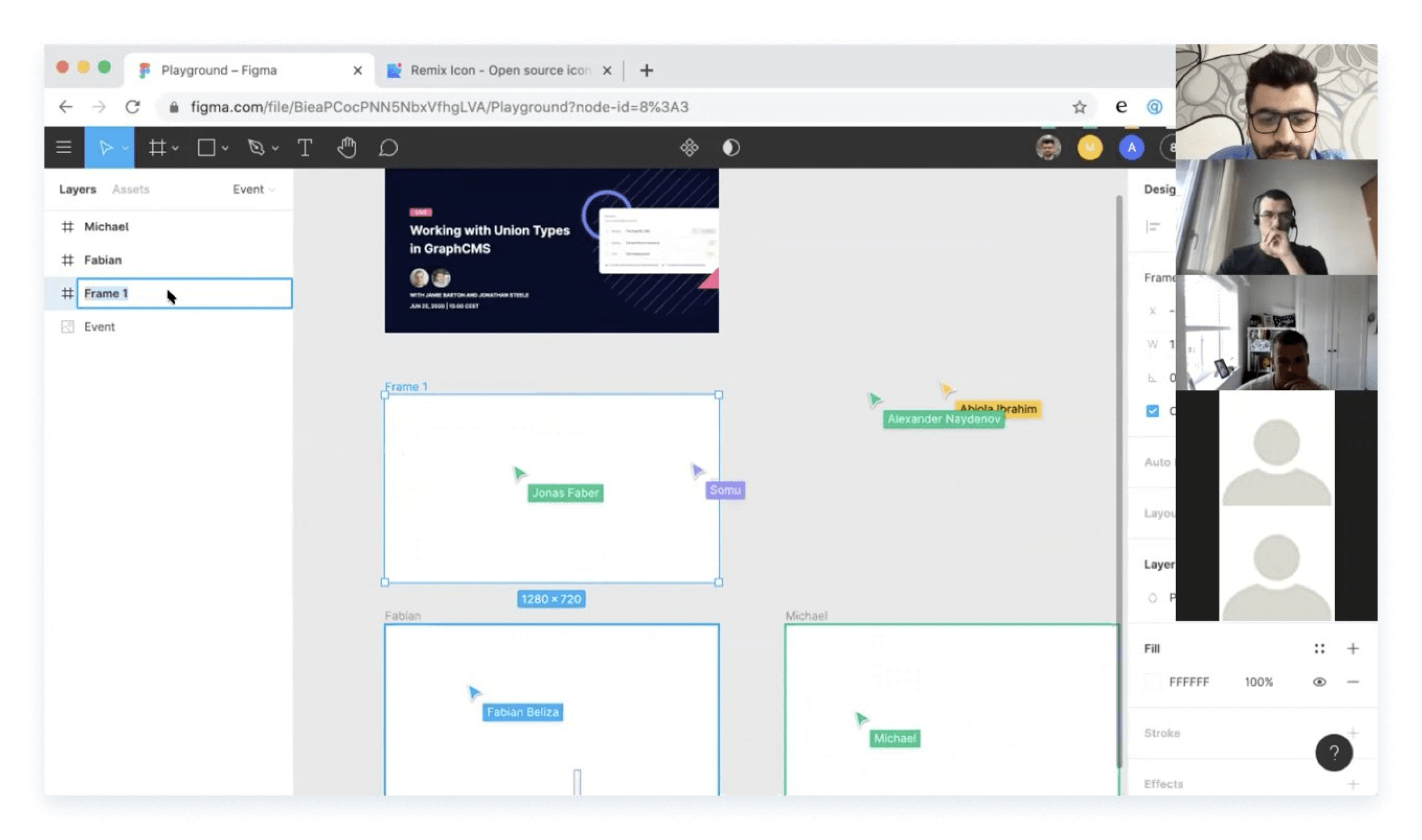
📝 ScratchpadAnchor

This is the messy middle, this is where the fun lies. It's an open canvas to explore ideas, try out different patterns, get feedback, and iterate. This is also the page where the most collaboration happens. And it's often flooded with comments from the team.
Here's an example from one of the recent feature files. Yes, it can get pretty crazy at times.

✅ UIAnchor

This is the most organized page in the file. It's where the final designs/user flows stay. It's also the source of truth for our engineers working on the given feature. They would develop the feature by inspecting the designs from here.
Frames on the ✅ UI page are organized based on user flows. You would notice that we use the default style to title them. That's to benefit from Figma's automatic scaling of frame titles on zoom in & out. We also use this page to leave relevant notes for our engineer friends.
▶️ PrototypeAnchor

This page is optional. We only make use of this page when we create prototypes for the given feature. Prototypes are usually only needed to communicate a complex design or to present the concept to other teams or customers.
👌 QAAnchor

When the feature gets developed, we're asked to review the PR on GitHub by our engineers. We review the feature in our preview environment, take screenshots of where there's a mismatch in design, paste it on this page and leave comments for our engineering team.
We’re aware that our QA process isn't ideal and we're constantly looking to improve it. So if you've got any recommendations or suggestions here, please feel free to reach out.
Also, we've created a template file with all these pages, base frames and pinned it to the top of the ⚡️ Feature project to make the process of starting a new feature work fast and easy.

Keeping our files and projects organized in Figma has been massively beneficial for us and has made the process of collaboration between teams so much more efficient and fun. I hope you found this useful and can take away some principles to apply to your own process.

